LINKS
- Attack of the 50-Year-Old Comics
- Super-Team Family: The Lost Issues
- Mark Evanier's Blog
- Plaid Stallions
- Star Trek Fact Check
- The Suits of James Bond
- Wild About Harry (Houdini)
Looking for another project to test out my new set of pen nibs and brushes, I decided to attempt a caricature of an old favorite TV character; Dark Shadows’ resident vampire, Barnabas Collins. Rather appropriately, it ended up being a pain in the neck.
First, I had to find a reference photo of actor Jonathan Frid made up as Barnabas (just as an aside, it’s depressing how a Google image search for “Barnabas Collins” turns up so many pictures of Johnny Depp). Interestingly, Frid manages to look quite remarkably different from various angles and over the course of the series, which didn’t make my job any easier. I ended up deciding I liked the eyes in this headshot, which somehow for me capture Barnabas’ twin qualities of menace and suffering:
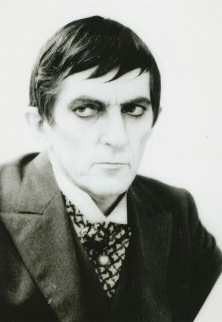
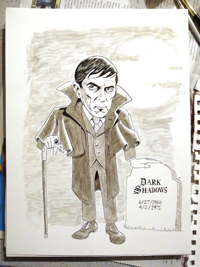
In hindsight, it probably wasn’t the best image as it’s kind of washed out and light on details (which is part of what makes it cool, too, ’cause it looks like it was taken in Barnabas’ original time period). Anyway, since what drew me in were the eyes, I chose to accentuate them in the caricature, and make them larger than life. Which is fine, only somehow over the course of the project, I kept adjusting everything else in relation to the eyes, obsessing over the nose, the mouth, etc, each in isolation, until I ended up with something that didn’t look at all like what I’d intended, because I failed to step back and look at how all the elements connected. Then when it came time to apply the inks, I was so focused on how to hold the nib pen that I didn’t focus my gaze on more than a couple millimeters of the image at a time. It didn’t help that I’d for some reason determined I was going to churn out the whole thing, start to finish, in a couple hours time. And here’s what that gets you:
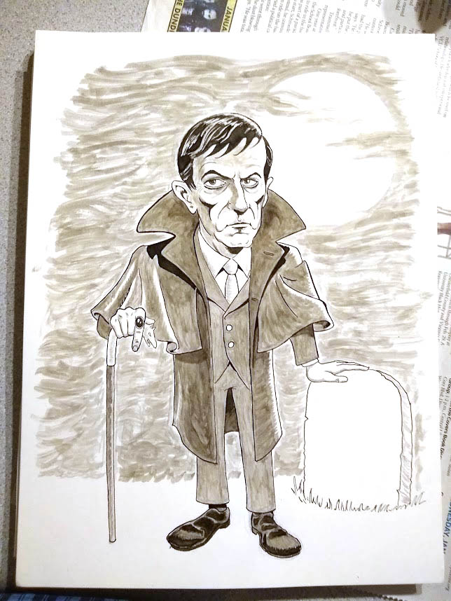
Not so bad maybe for an image that says “generic vampire” — or “creepy dude” since there’s no fangs on display — but not what I’d hoped for. I was pretty happy with the “fog” effect a #6 “shader” brush got me (especially since it just kind of “happened” in the moment), and the cloak came out pretty well, but I was not pleased, overall. Laura snapped a photo of it almost as soon as I made the last stroke and pasted it to Facebook (ugh) asking friends, “What should go on the tombstone?” She got some interesting responses, but a more pertinent question for me was, “Who is it supposed to be?”
And so I learned my first two lessons: first, don’t rush a project, because that will never end well, and second, always take time to step back and look at the whole picture; don’t get lost in the details.
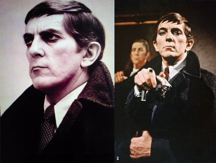
So almost immediately I started over. Usually I just move on from my artistic failures and shove them in a drawer (or the trash), but for whatever reason, this time I was determined to try a do-over. So I traced over the figure and started from scratch on the head, adding a couple more reference photos to the mix and watching a couple episodes of the show on Amazon Prime (always fun).
This time I was a lot happier with the results.
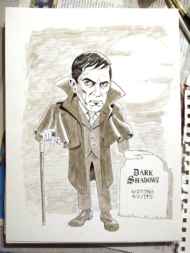
Or anyway, I was temporarily happy, until I came back the next day and decided I had drawn former CBS News anchor Dan Rather. I snapped the photo above and pulled it on my PC, and somehow just seeing the image in a different scale, on a screen instead of paper, brought all the problems into focus. I’ve often seen it suggested that you should hold your drawings up to a mirror to find the problems; now I know seeing it in a different scale can help, too.
So lesson #3: check your work in a mirror and view it a different scale before you commit to ink.
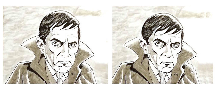
Anyway, I decided my revised Barnabas looked way too healthy for a 100-something-year-old vampire. His face was too full and well-fed. Also, there was too much forehead showing below those stylish bangs. So I went into Photoshop, lowered his forehead (which also meant widening the top of his head) and pulled the sides of his jaws closer together, accentuating the gaunt cheekbones. I also decided to give more of an angle to the nose. This got me a lot closer to where I wanted to be.
The difference is more obvious if you see the faces next to each other:
One thing I struggle with is drawing faces as they are, as opposed to the “idealized” or stylized generic faces I taught myself to draw as a kid, when I basically just cribbed from comic books. Whenever pencil hits paper, muscle memory takes hold of my wrist and people start looking like superheroes. In real life, people don’t always have perfectly symmetrical faces, straight noses, lantern jaws, eyes that line up, Ken doll hairlines, etc. It’s the little idiosyncrasies that define us and make one person distinct from another, and the art of capturing likenesses is to find those things and put them on the page. Ian Fleming once wrote that ” The difference between a good golf shot and a bad one is the same difference between a beautiful and a plain woman – a matter of millimetres.” The things that make us recognize a specific person out of millions are often tiny details.
So anyway, now I have an image that’s more or less what I was shooting for. The problem is it only exists as a Photoshop file, so if I ever want a paper copy, I’ve got to go through all that inking a third time. It ain’t likely.
The real kicker is that I’m not even sure you could call this a “caricature.” It’s a comic-book like drawing, but is it exaggerated? Whimsical? It’s a more-or-less “realistic” head on a dwarfish body. Neither fish nor foul.
Just to prove I can never leave anything alone, a couple days later I pulled out my Kindle Fire and used my stylus to try a more cartoonish approach, using the “Medibang Paint” app. I have to say I’m probably most satisfied with that version, since it doesn’t even try to be “realistic.” I like that it’s limited to a minimum of linework, though honestly, having spent so much time wrestling with Mr Frid’s features earlier probably made it a lot easier to reduce them to just a few angles and curves. The cool part is that there’s just enough there to suggest “Barnabas,” and the viewer can do the rest of the work.
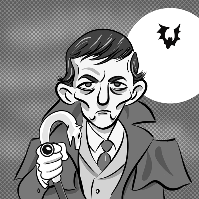
Of course, your mileage may vary, and in a week’s time, I may dislike this one as much as the others.